Components
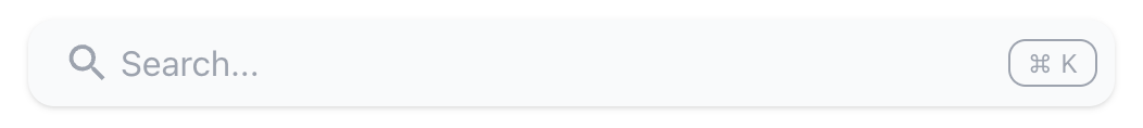
Mendable Search Bar
Before install, make sure you have either signed up through our platform or we have provided you with the ANON_KEY. Without the key, you won't be able to setup the search component.
Mendable Search Bar
The search bar is a component similar to an search bar input. When the user clicks the search bar, it will open a modal with Mendable Search.
Using React 17?
If you're integrating Mendable Components with React 17, please consult our guide here.
Usage
import { MendableSearchBar } from "@mendable/search"

const style = { darkMode: false, accentColor: "#123456" }

<MendableSearchBar anon_key='YOUR_ANON_KEY' style={style} />
You can also customize the search bar style using the searchBarStyle prop. Here is an example:
<MendableSearchBar
  searchBarStyle={{
    backgroundColor: '#1F2937',
    borderColor: '#6B728033',
    color: '#E1E3E7',
    shadow: false,
  }}
/>
Keyword Search
We also provide keyword search as seen on the Langchain Documentation. This combines keyword with AI Search in one modal. When the user starts typing, it will almost instantly display results for the search query. It also allows the user to use AI search by pressing "Ask Mendable AI".
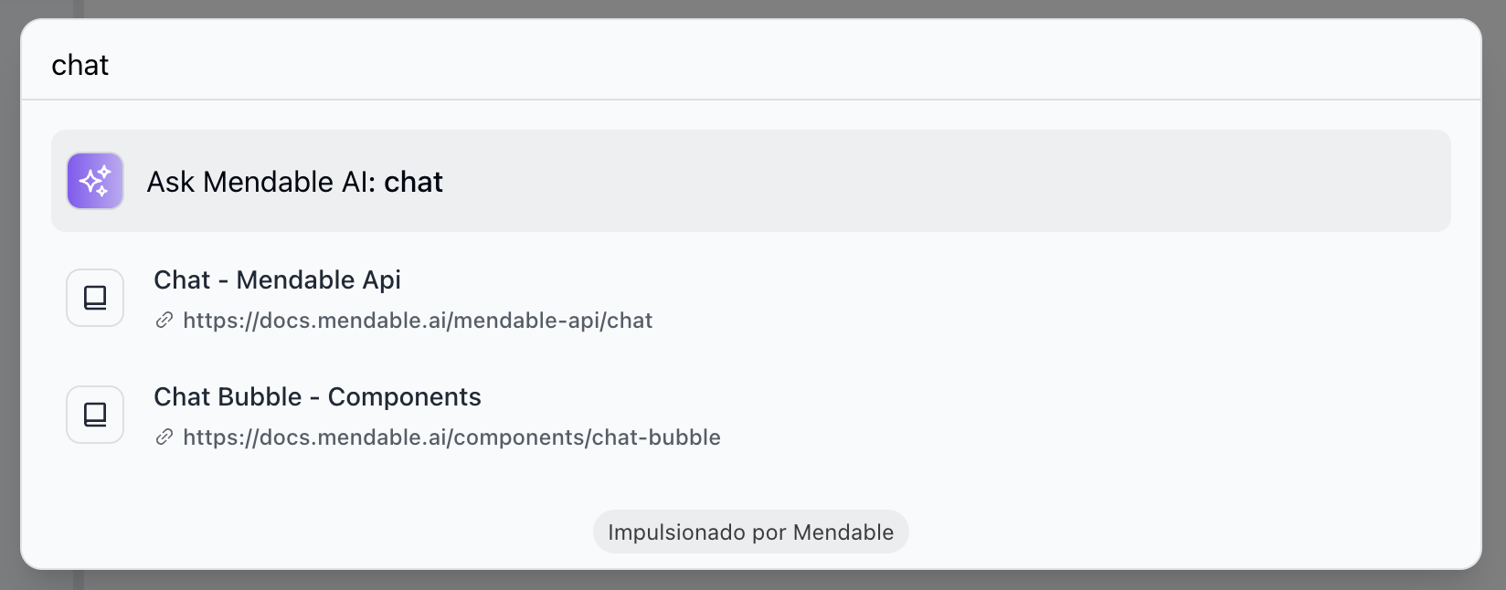
To enable keyword search, you need to pass the showSimpleSearch prop to the component.
import { MendableSearchBar } from '@mendable/search'

;<MendableSearchBar anon_key="YOUR_ANON_KEY" showSimpleSearch />
Props
| Prop | Type | Default | Description |
|---|---|---|---|
| anon_key (Required) | string | - | Mendable Search ANON_KEY |
| placeholder | string | "Search..." | Placeholder text for the searchbar |
| context | string | false | Additional context to be passed to the AI |
| dialogPlaceholder | string | "How to deploy my application?" | Placeholder text for the mendable bot input bar inside the modal window |
| hintQuestions | array | - | Array of questions to show as suggested questions when the component loads |
| style | object | - | Style object |
| style.darkMode | boolean | false | Dark mode |
| style.accentColor | string | "#123456" | Hex Accent color |
| style.backgroundColor | string | "#123456" | Hex Background color |
| searchBarStyle | object | - | Style object for the search bar |
| searchBarStyle.backgroundColor | string | - | Background color of the search bar |
| searchBarStyle.borderColor | string | - | Border color of the search bar |
| searchBarStyle.borderRadius | string | - | Border radius of the search bar, example: "20px" |
| searchBarStyle.color | string | - | Text color of the search bar |
| searchBarStyle.showShortcut | boolean | true | Show the shortcut key |
| searchBarStyle.searchIcon | object | - | Search icon object. Can be a JSX.Element or a image URL |
| welcomeMessage | string | "Hi, how can I help you?" | Welcome message |
| cmdShortcutKey | string | "k" | Define the short cut for users to open mendable with. By default, it is CMD + K or CTRl + K |
| botIcon | object | Bot Emoji | React: Bot icon HTML tag, can be a img, svg or any other HTML tag, Vanilla JS: image url |
| userIcon | object | User Emoji | React: User icon HTML tag, can be a img, svg or any other HTML tag, Vanilla JS: image url |
| showSimpleSearch | boolean | false | Show simple search bar option on the top |
| askAIText | string | "Ask Mendable AI" | Text for the ask AI button on the keyword search component |
| positionOverwriteClassname | string | - | Classname that helps overwrite the position of the floating button |
| messageSettings.openSourcesInNewTab | boolean | false | Open sources in new tab |
| messageSettings.prettySources | boolean | false | Display the sources by title / sub-section instead of long URL |
| messageSettings.hideSources | boolean | false | Hide the sources |
| messageSettings.sourcesFirst | boolean | false | Show the verified sources before showing the answer |
| privacyDisclaimer | string | " " | Privacy disclaimer text |
| inputSettings | object | - | Input settings |
| inputSettings?.askButtonStyle | object | - | Ask button style object |
| inputSettings?.askButtonStyle.activeColor | string | "#123456" | Ask button background color when active |
| inputSettings?.askButtonStyle.disabledColor | string | "#123456" | Ask button color on a disabled state |
| inputSettings?.askButtonStyle.textColor | string | "#123456" | Ask button text color |
| inputSettings?.askButtonStyle.disabledTextColor | string | "#123456" | Ask button text color on a disabled state |
| footer | object | - | Footer object |
| footer.bottomRightLink | object | - | Bottom right button object |
| footer.bottomRightLink.label | string | "" | Text label for the bottom right button |
| footer.bottomRightLink.link | string | "" | URL for the bottom right button |
| language | string | "" | Defaults to user's personal settings. Anything else will overwrite the language for all users. Languages available: pt,es,fr,it,nl,de,ja,ar,ro,el |
| onMessageForTracking | function | - | Callback function that triggers when a message is sent. It receives the question, answer and sources as parameters |
| onSourceClickedForTracking | function | - | Callback function that triggers when a source is clicked. It receives the source as a parameter |
| onSwitchingSearchType | function | - | Callback function that triggers when the search type is switched. It receives the type as a parameter |
| onRateClicked | function | - | Callback function that triggers when the user likes or dislikes a message. It receives the isLiked, question, answer and sources as parameters |
Callback functions
The Mendable Search Bar provides callback functions for tracking events inside the component.
- onMessageForTracking : This function is triggered whenever a message is sent in the component. The function receives the question and the answer as parameters. This can be used for logging or analytics purposes.
Example
import MendableSearchBar from 'mendable-search-bar'

function MySearchComponent() {
  const handleOnMessage = (question, answer, sources) => {
    console.log('User asked:', question)
    console.log('Received answer:', answer)
    console.log('Sources:', sources)
    // You can add additional tracking or analytics logic here.
  }

  return (
    <MendableSearchBar
      anon_key="YOUR_ANON_KEY"
      onMessageForTracking={handleOnMessage}
    />
  )
}
- onSourceClickedForTracking : This function is triggered whenever a source is clicked in the search results. The function receives the source as a parameter. This can be used for logging or tracking user interactions.
Example
import MendableSearchBar from 'mendable-search-bar'

function handleOnSourceClicked(source) {
  console.log('User clicked on source:', source)
  // Add tracking or logging logic here
}

;<MendableSearchBar
  anon_key="YOUR_ANON_KEY"
  onSourceClickedForTracking={handleOnSourceClicked}
/>
- onRateClicked : This function is triggered whenever an answer is rated as helpful or not. The function receives the isLiked as a parameter which is true for 'Yes' and false for 'No'.
Example
import { MendableChatBubble } from '@mendable/search'

function handleOnRating(isLiked, question, answer, sources) {
  console.log('User liked the question?', isLiked)
  // Add tracking or logging logic here
};

<MendableSearchBar anon_key="YOUR_ANON_KEY" onRateClicked={handleOnRating} />
Use these functions to gain insights into how users are interacting with the search bar.
Metadata Filtering (Beta)
You can filter out sources based on metadata on the component level. This is useful if you want to filter out sources based on the version of the document or any other metadata you have ingested. Metadata ingestion is currently only available through the /ingestDocuments endpoint.
To use metadata filtering on the component level, use the metadata prop in your component:
<MendableSearchBar
  anon_key="YOUR_ANON_KEY"
  metadata={{
    version: { $lte: 6 },
    age: { $eq: 22 },
  }}
/>
The metadata parameter is an object that contains the metadata you want to filter on. The key is the name of the metadata and the value is an object that contains the operator and the value you want to filter on.
The above example will filter in only the sources that have a version less than or equal to 6 and an age equal to 22.
Metadata supports the following operators:
- $eq - equal to (string, int, float)
- $ne - not equal to (string, int, float)
- $gt - greater than (int, float)
- $gte - greater than or equal to (int, float)
- $lt - less than (int, float)
- $lte - less than or equal to (int, float)
- $in - matches any value in an array (string, int, float)
It currently does not support and, or operators, but we plan to support them soon.